2020
E-Commerce Redesign
Prototype
The Challenge
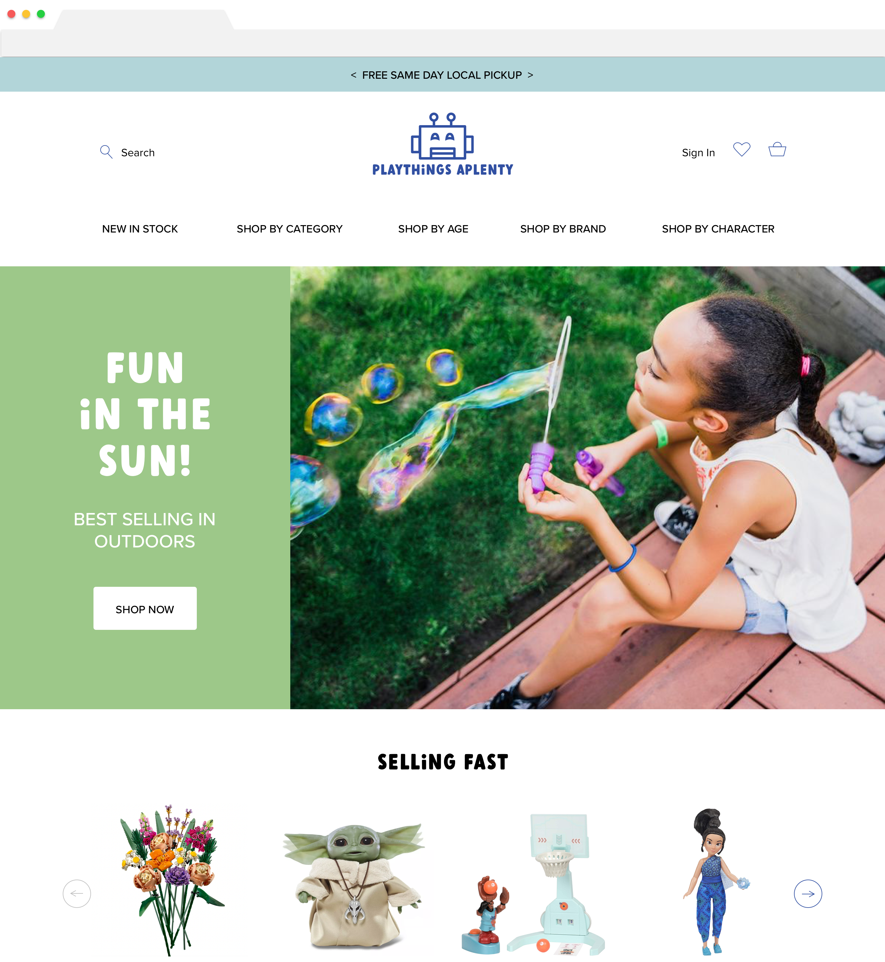
Playthings Aplenty is an independent toy store in South Carolina. While they have a large offering and are beloved by locals, their e-commerce site is inaccessible to shoppers because of the poorly thought out user interface and confusing information architecture.
In this case study I use several research methods to improve the navigation, while also addressing the outdated visual design and checkout flow.
100% Bounce Rate
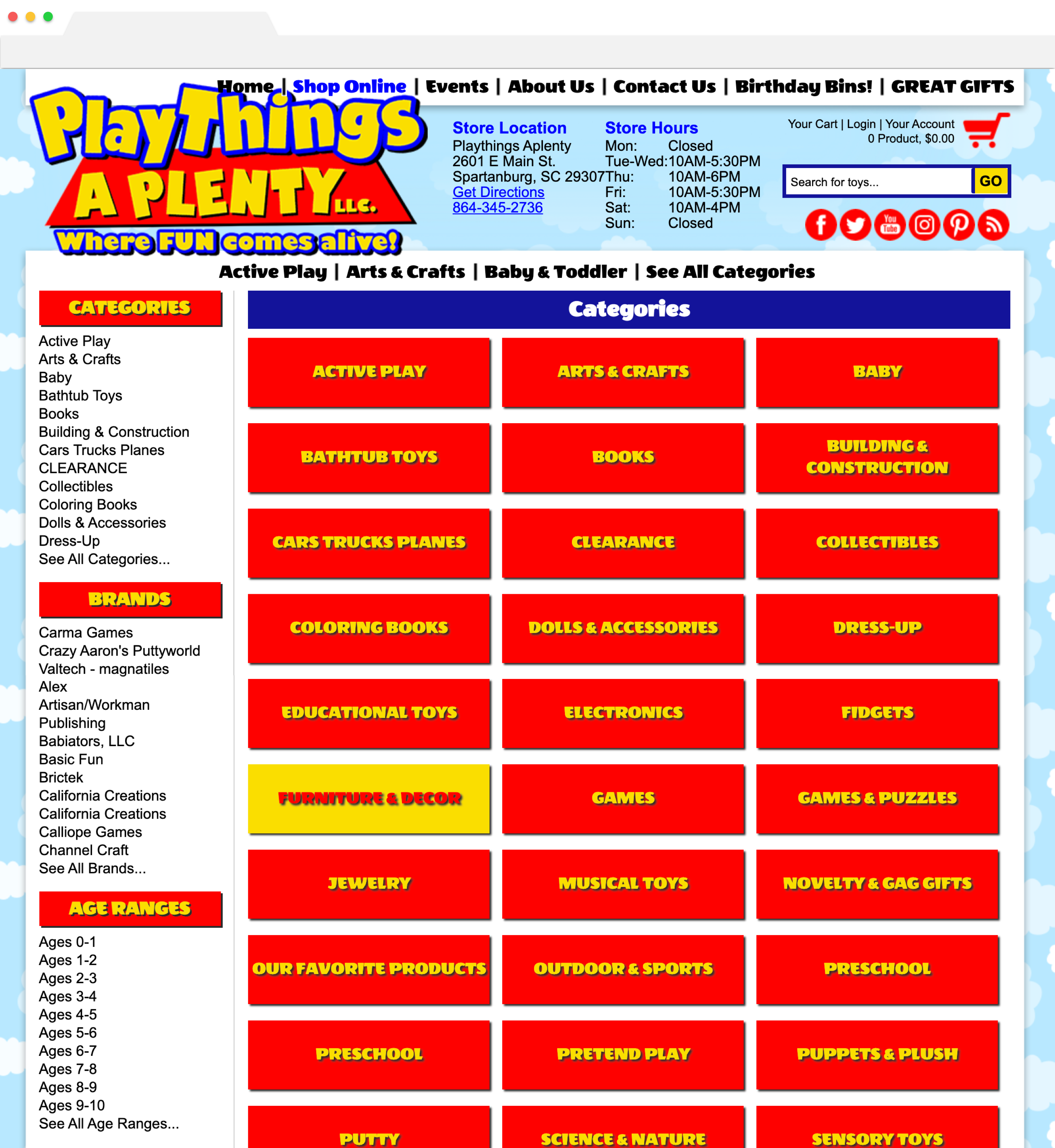
Playthings Aplenty suffers from a high bounce rate because users find it difficult to navigate to products and make purchases.
Three Major Problems:
1. Numerous top-level categories of various granularity
2. Users don't have a path to browse all, and then narrow focus
3. Inaccessible, overwhelming visual design elements
Research Methods - Talk to the Shoppers
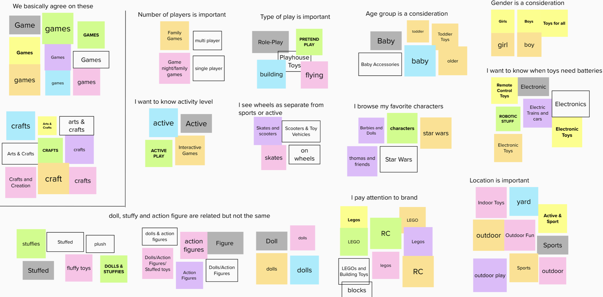
Card Sort - Affinity Map
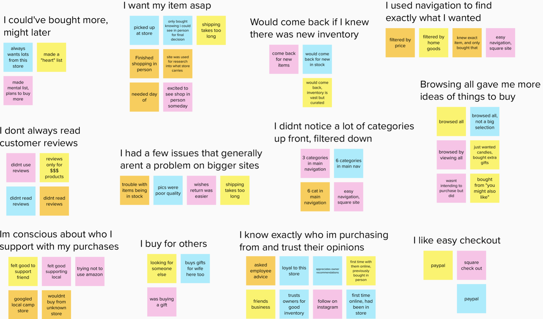
User Interviews - Affinity Map
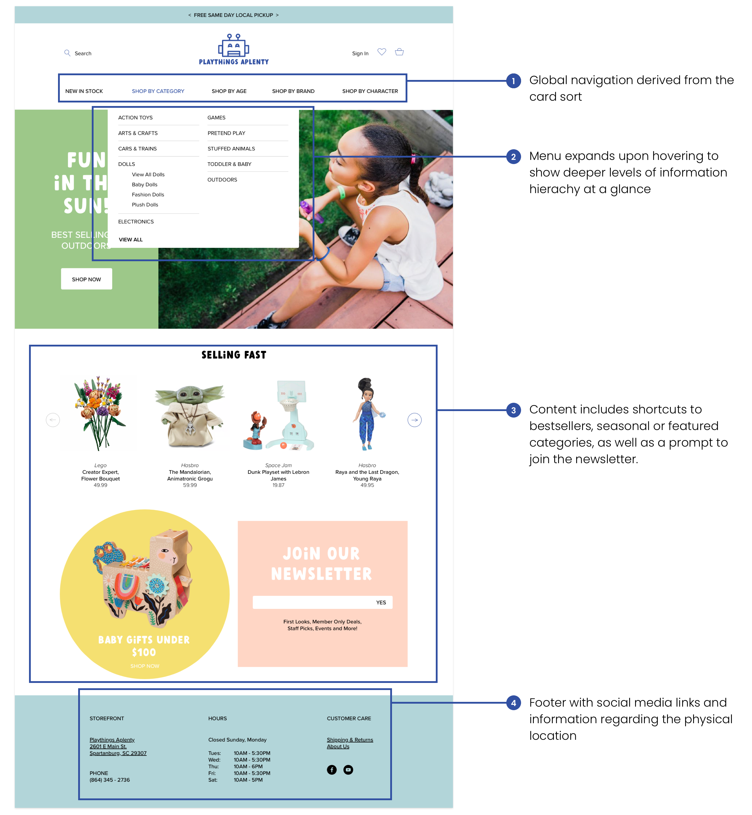
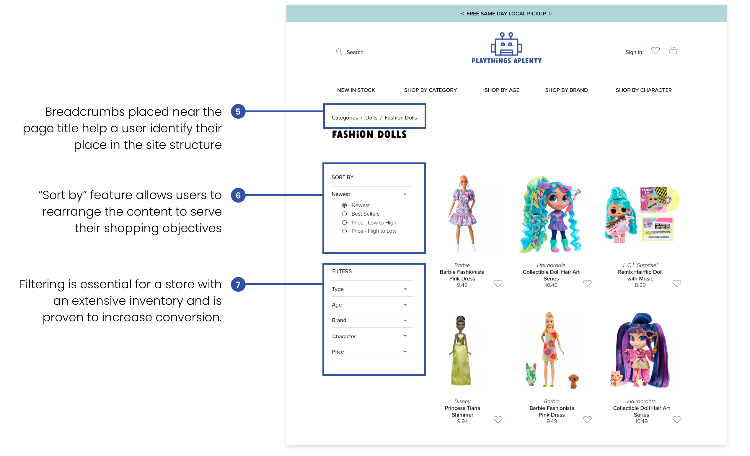
Because the inventory is so large and could be categorized in many different ways, I started out by conducting an open card sort with parent test subjects. One surprise for me was how important specific characters are, for example: when given several train and car toys to organize, Thomas the Train was almost always given its own category.
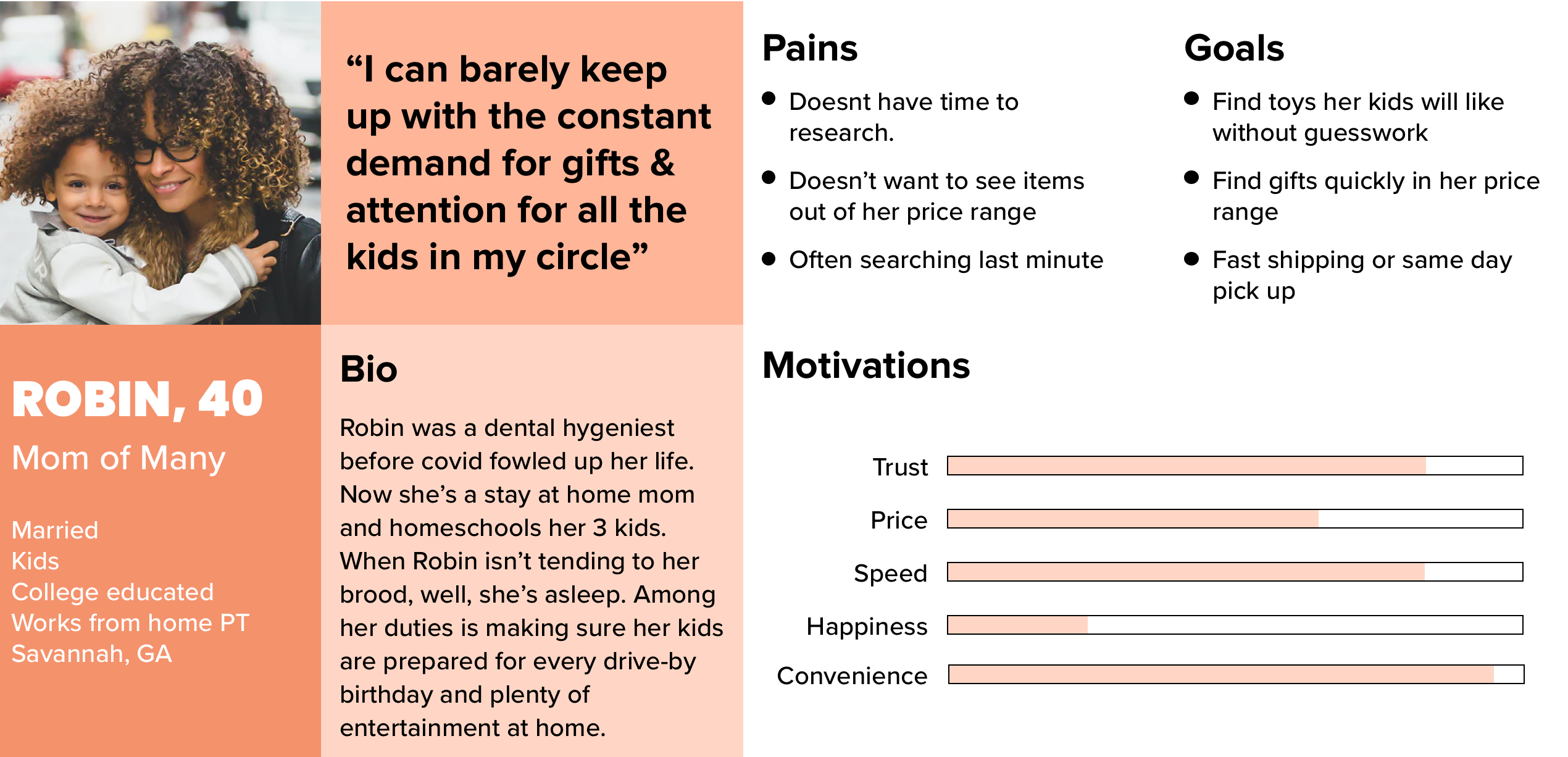
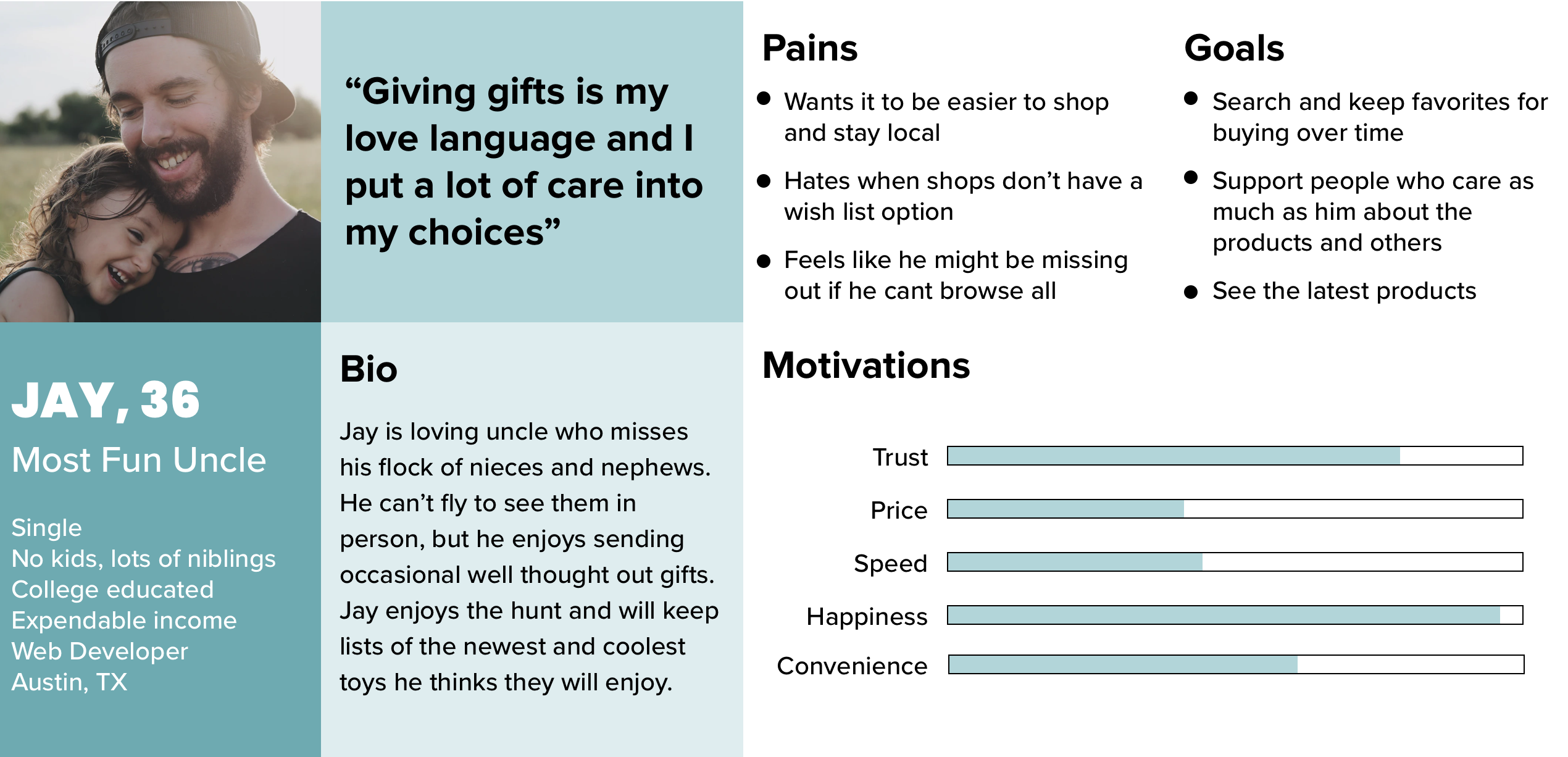
With a new group of shoppers, I conducted user interviews about the last time they shopped online, what makes them repeat customers and shopping local. The results helped to generate two user personas.
Key Takeaways:
1. People generate ideas for future purchases by "browsing all"
2. Users need safe, same day, curbside pickup
3. When shopping local, users value the owner's opinion on products
User Personas
Information Architecture Overhaul
The Competition
Unfortunately for our store, Amazon is its biggest competitor, but there are some areas we can be David to Goliath.
1. Ask the store owner a question about a product
2. Pick up an item the same day, immediately after purchase
The folks I interviewed expressed that while they don’t always read reviews on local sites, they do care about owners opinions and trust the quality of the inventory, so I included an “Ask us a question about this item” feature.
Another feature amazon isn't capable of is local pick up. Many of the people I talked with said they use websites to check out a store first before buying in person, they also like being able to get an item the same day and still be covid safe.
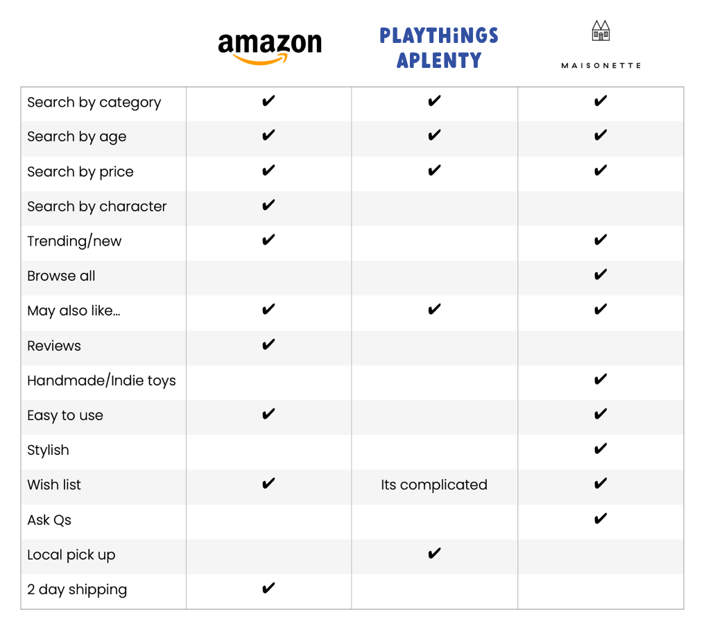
Competitive Analysis
Improved Checkout Flow
Final Thoughts
Importance of research and information architecture.
As an avid online shopper, it could've been easy for me to take one look at the original website and assume I knew what was wrong. Instead, I took the time to do a full UX process of card sorting, interviews, affinity maps, user personas and competitive analysis. Every process I went through yielded some unexpected results I wouldn't have come to on my own or if I just did a cosmetic makeover.