2021
Healthinity App
A German Startup Needs a Prototype
Healthinity is an early stage start-up based in Germany looking to break into the digital therapeutics industry in America.
Healthinitiy provides users the opportunity to receive insights about their health before it’s too late. By participating in a test-kit subscription and questionnaires, a user’s health parameters are decrypted and transformed into personalized recommendations to improve their health. Users are finally able to fully understand their body and to take control of their health.
We were consulted to design a mobile app that comprises personalized health recommendations in the form of a dashboard that is intuitive, doesn’t overwhelm the user, encourages continued engagement and lowest possible barriers to buying their supplements.
Team
Myself - Design Lead, participated in all aspects
Mireya Cano - Project Manager
Annie Morris - Client Communications
Keri Belcher - Research Lead
Tools & Methods
Figma, Miro. User Interviews, C&C Analysis, Affinity Mapping, Personas, Design Studio, Journey Mapping, User Flows.
Duration
Three Weeks
Research Methods
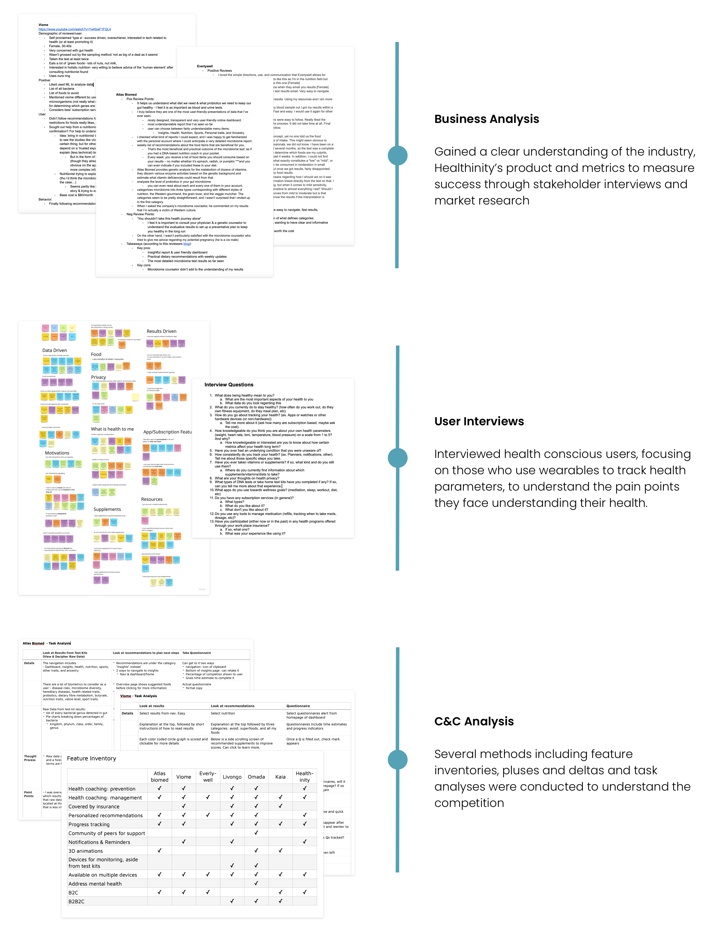
Because Healthinity is still early stage, the product presented to us was somewhat ambiguous and subject to change. In order to break down the complexity of their potential offerings into manageable design initiatives, we started with a healthy amount of research into similar companies and their potential users.
In a Nutshell:
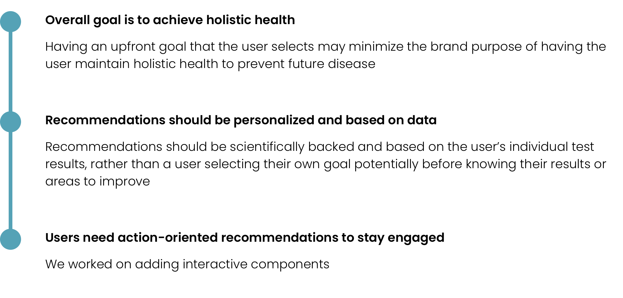
- Users are motivated by seeing trends over time in order to be healthy in the long run
- Users have data driven mindsets and need encouragement to maintain healthy practices
- Users tend to only supplement if they have a deficiency
- Recommendations should be actionable, prioritized and clearly defined
- Address mental health to stay competitive. Users care about how their physical health affects mental acuity
Humanizing the Research
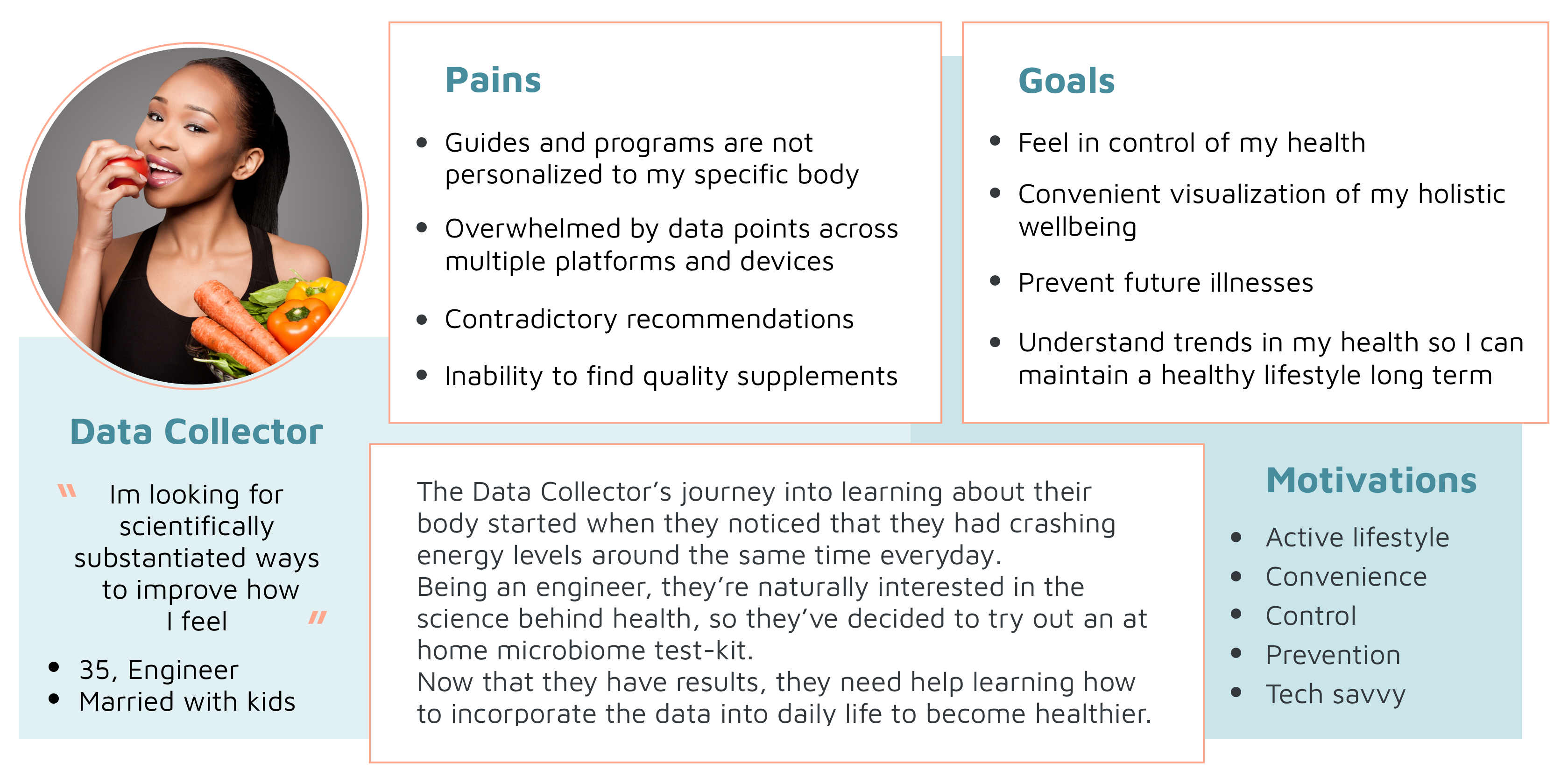
The Data Collector is tech-savvy and health conscious. She utilizes wearables to feel in control of her health.
Pen to Paper
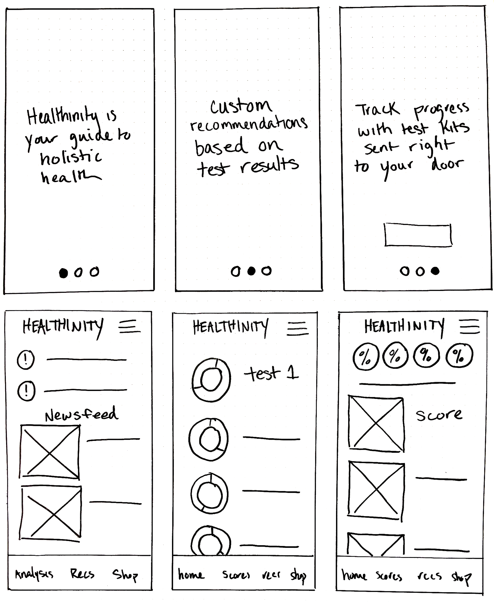
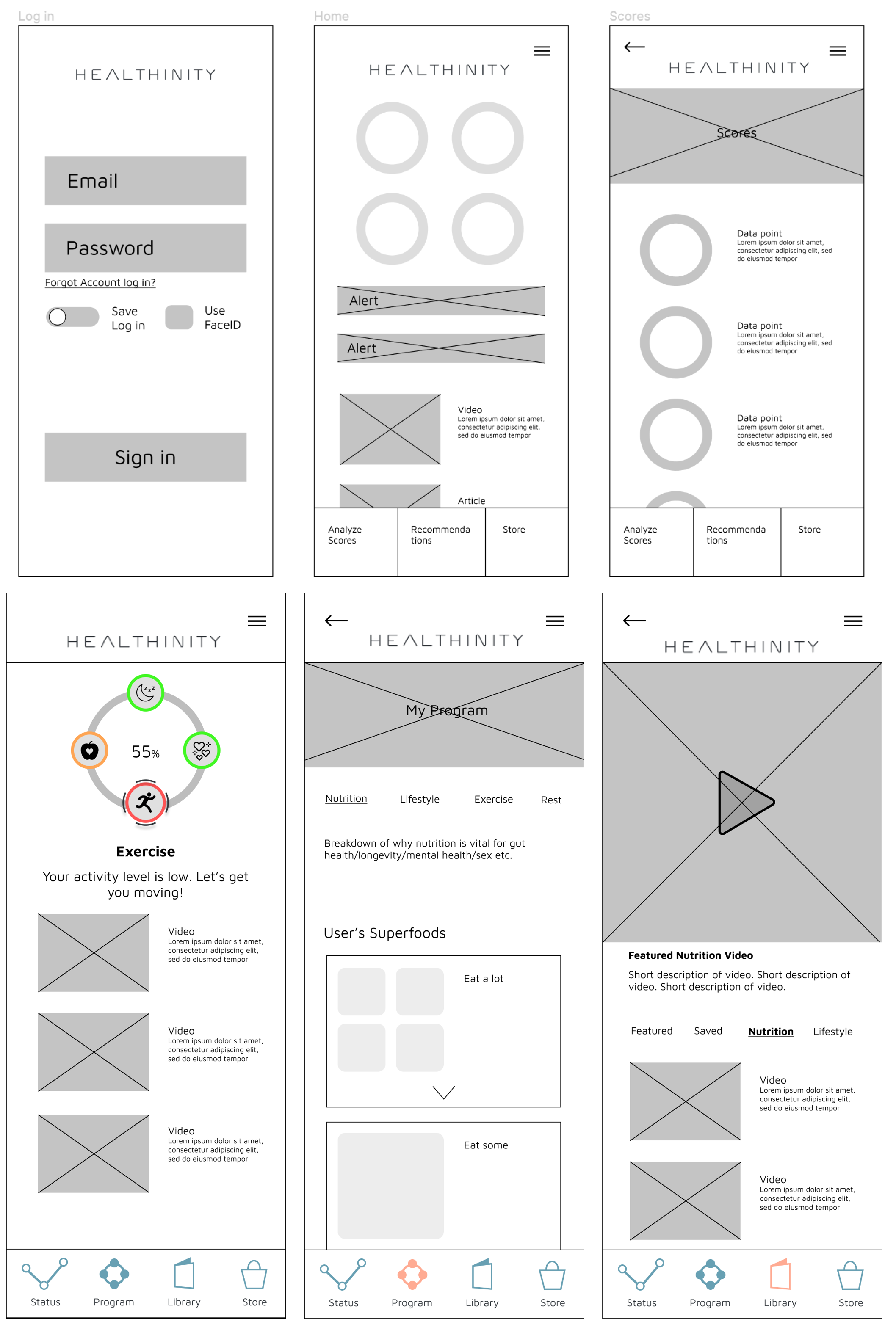
Because Healthinity is a constantly evolving start-up, we faced some challenges nailing down the full spectrum of data and services they plan to provide users. This led to many different iterations (at right) and questions within a short span of time.
- To include goals or not? If so, in what respect?
- How much daily interaction should we include?
- How many categories of health recommendations are there and what should they be?
- How customizable to make the app?
Narrowing our Focus
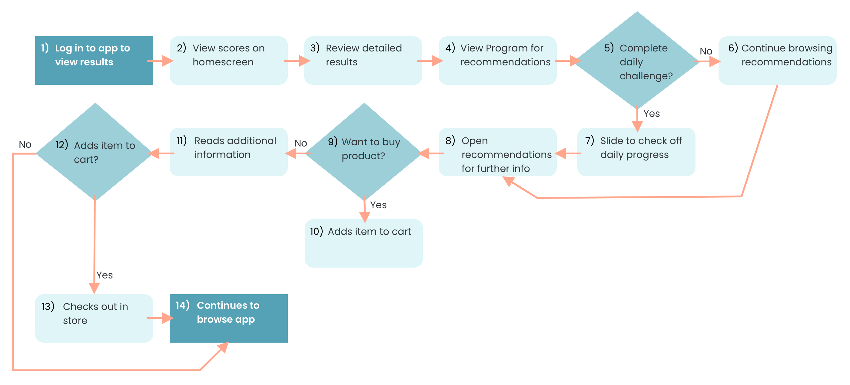
A Path Forward
First Round of Usability Testing
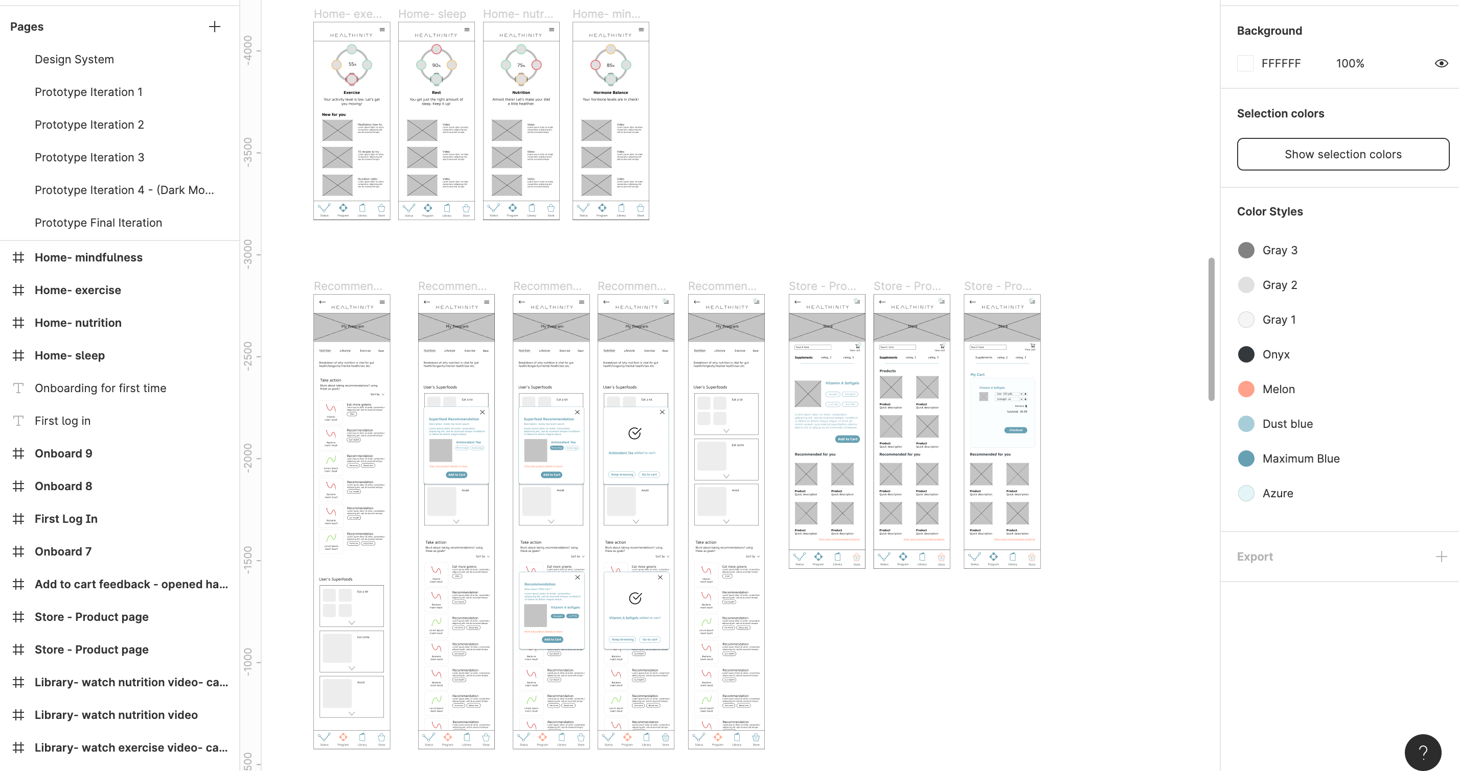
The lo-fi prototype included onboarding, dashboard and recommendations. We asked users to complete 4 tasks and talk us through their thought process.
1. Change category wheel on homepage
2. Navigate to each page with ease via the bottom navigation
3. View and filter results
4. Understand how to access, complete, and read recommendations